A new logo is approaching (with a blog redesign)! One of the tasks on our Hack'n'Plan (a tremendous game planning web app, by the way) which wasn't directly connected to our game was designing a real logo for our studio, Elrel. Actually, many of you may not have heard of the word Elrel yet, because as far as this blog is concerned, it is only written in the footer. It is, however, our twitter handle and on the splash screen of our first game. The logo for our first game was rushed because we really wanted to release it. Thus, it was high time Elrel got a nice logo; one which can be easily recognized.
I want to dedicate a whole entry to the logo's creative process because of this post, which highlights the creative process behind Tiny Phoenix's logo. Despite what some comments say, I think the logo is splendid, and I'm glad the team reached something they liked. Designing a logo is not easy, and I learned that first hand while making our logo. Not all of you will agree with the decisions we made, and some of you may not like the final result. But doing this taught me a lot of things about what goes into a logo, and I think some if it may be useful for you to know. But just to be clear, this isn't a post about logo design. It's about the thought process.
Elrel
What is "elrel"? It's a five letter word that has absolutely no meaning, as far as I can find. It's just what came to mind some 14 years ago when I made a funny sound with my mouth and Joraaver wanted to make the same sound, but couldn't. He just said "elrel." With that origin story in mind, I started making logos.
The Logos
Let me start by saying that if the word means nothing, then starting is difficult. So just let go of your inhibitions and draw randomly. If you feel like, pray for a happy accident, in a Bob Ross sort of way.
I started with some funny box icon thing. Let’s just say that was warm-up. I played with the idea of stick figures fighting or running through the logo. I imagined the animation. It was clicking. I liked that last one of the four.
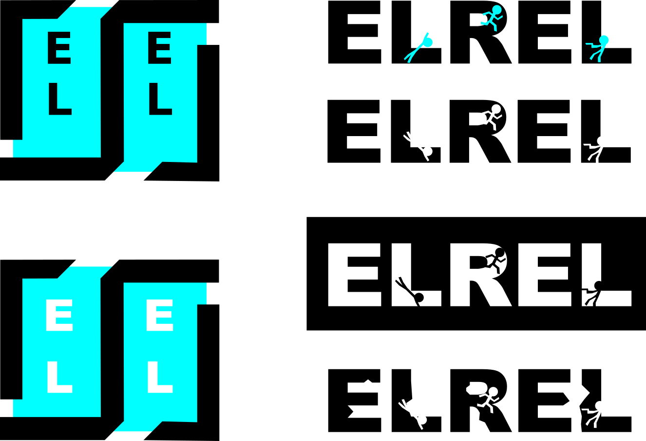 Funny box things, and then people running.
Then I toyed with the idea of letting the letters hang vertical. “Elrel” is a short enough word for that. Of those, I saw potential in the man standing in the rain, with lightning flashing. Animate that, and something pretty might still come.
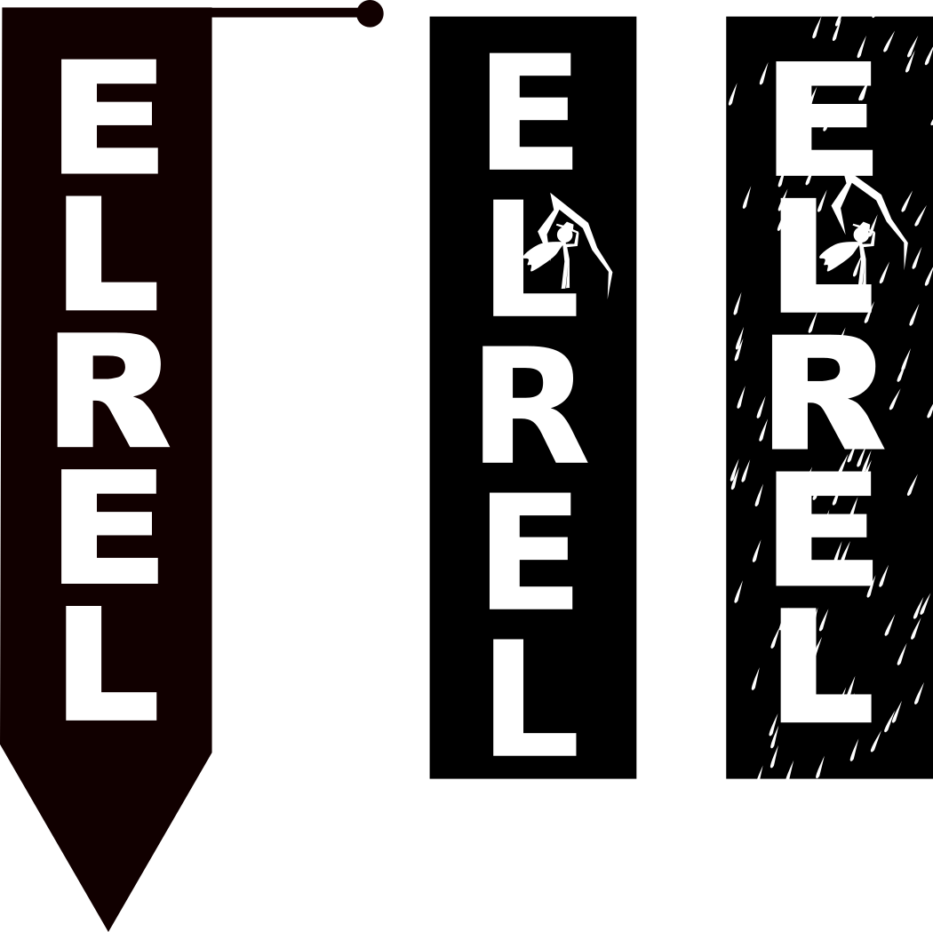 Letters hanging vertical.
Then I dropped the idea of stick figures and put some emphasis on the E. Think of the big old storybooks, where the first letter of the book or the chapter is some gigantic, fancily drawn form. Or look at Valve’s typography. I still wasn’t feeling any attachment to these logos though. Maybe I am not good enough or didn’t try hard enough, but I was not getting the vibe. It was time for something else.
 Like a storybook?
Where can you find meaning if the word has no meaning? For some it’s a stretch, but look at your (or your company’s) values or philosophy. What are you trying to achieve? These are ideas we hadn’t thought much about, but we tried to put some words down. At this moment, I thought of Vlambeer, the successful creators of Nuclear Throne, Ridiculous Fishing, and more. I hoped to find some insight to the logo of a seemingly random name, but alas, it actually means something. You can read about that here. However, they say that their logo was made "in twenty seconds." To me, that mean "don't sweat it." The logo doesn’t need to be better than sliced bread, just something you can be happy with.
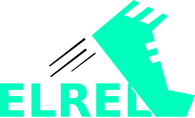
This leads us to the green sprinting foot logo. I think I was thinking of something lame like “live fast and free.” I can’t help it; I’m a Sonic fan. But really, it just looks like the less popular cousin of Adidas. No go.
Now comes the fist. It has something to do with breaking barriers or new frontiers. I liked it, but it didn’t read all that well. The bird with the marmalade jar was an attempt to lighten up from the whole philosophy idea. It didn’t need to be that deep. It was a nice bird, but a far cry from a nice logo.
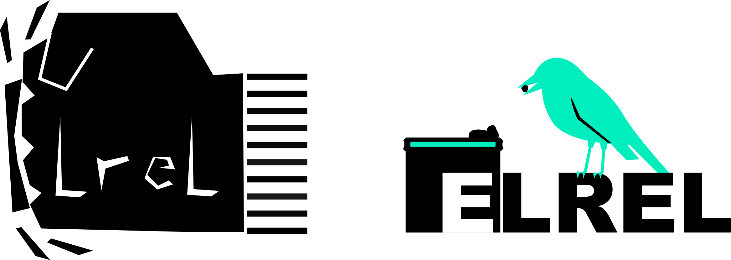 Fist and bird.
Ahh, the lava lamps. They are captivating little contraptions which kept me pacified for many hours; perhaps in the way that our games should captivate our audience. We really thought we had something going in the last red logo. We were very close to just stopping and plastering that thing everywhere. Honestly though, we were 90% happy. I know that I said not to sweat it too much, but this logo is going on our games, our site, our lives. No pressure, but we weren’t there yet.
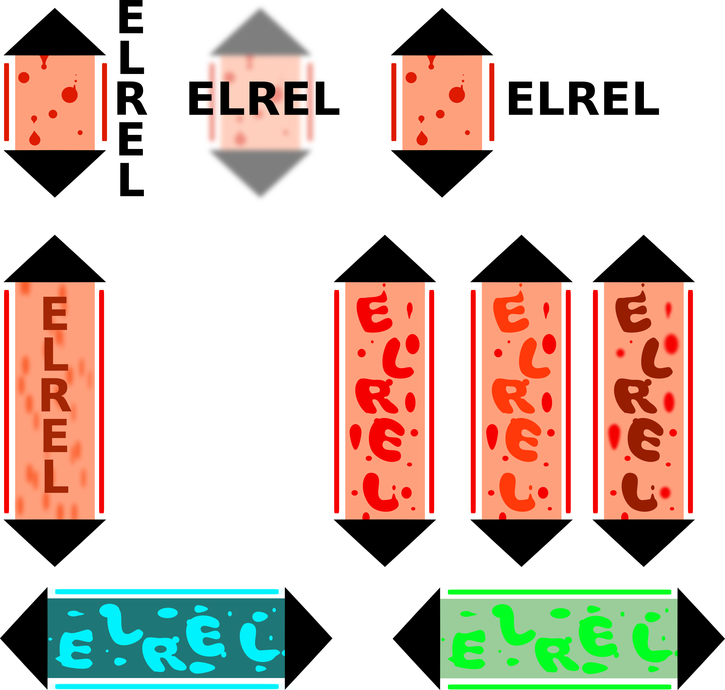 Lots of lava lamps (or cryogenic stasis tubes).
Which leaves us with the dying cats. Now I know this is a tad unfair, but “elrel” isn’t perfectly meaningless. It was given meaning by my 7th grade teacher, who said it sounded like a dying cat when I made the discordant noise in class one day. I hadn’t really thought about it until this point because it was a tenuous connection. But I ran with it. Thus, we ended with the last cat. I like the first cat with bulging eyes more, but it’s too much an imitation for me to use comfortably. When I don’t know how to draw something, I make a blatant copy first (I can’t draw cats). But I digress. That’s our logo!
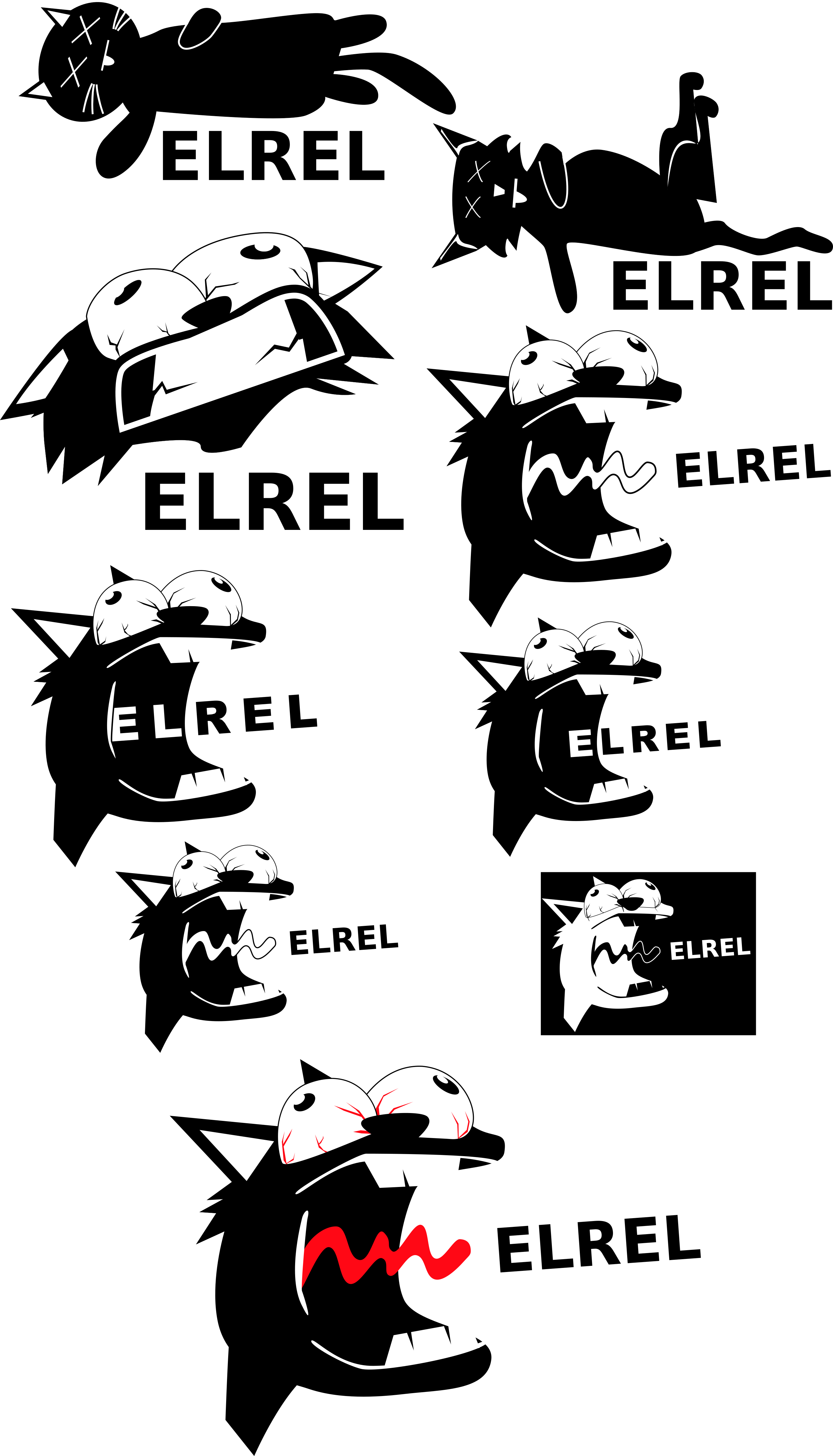 Lots of dying cats.
Here’s a summary of what I learned:
Types of Logos
I believe there are three types of logos, with some icing if you'd like. You could make an icon-based logo, a typography-based logo, or a logo involving both. The icing? Animation. Not necessary and not always right, but good to keep in mind. The point here isn't to limit the type of logos you can make. It's to provide options. Sometimes you see a good logo and think that your logo has to have some funny character alongside a name, but that's not true. I had to keep reminding myself to change styles. Granted, because I’m not the best vector artist, some things were outside my time and ability scope, but I still tried to stretch my wings.
Source of Inspiration
There are three things to look at when brainstorming: other logos, philosophy, and origin. I looked at Naughty Dog, Vlambeer, Bethesda, and a whole bunch of other studios. I even looked at non-game studios. I read about company values and learned how some studios were formed. There’s a gold nugget somewhere. Just keep looking.
In a final act of complete contradiction, I will say this: it’s perfectly acceptable for your logo to mean absolutely nothing. It could be a flying elephant, while your studio is “Grounded Worms.” All it has to be is recognizable as your brand, and make you happy.
Thanks for reading, and feel free to discuss here or on reddit !
