Creating our Logo

     A new logo is approaching (with a blog redesign)! One of the tasks on our Hack'n'Plan (a tremendous game planning web app, by the way) which wasn't directly connected to our game was designing a real logo for our studio, Elrel. Actually, many of you may not have heard of the word Elrel yet, because as far as this blog is concerned, it is only written in the footer. It is, however, our twitter handle and on the splash screen of our first game. The logo for our first game was rushed because we really wanted to release it. Thus, it was high time Elrel got a nice logo; one which can be easily recognized.

     I want to dedicate a whole entry to the logo's creative process because of this post, which highlights the creative process behind Tiny Phoenix's logo. Despite what some comments say, I think the logo is splendid, and I'm glad the team reached something they liked. Designing a logo is not easy, and I learned that first hand while making our logo. Not all of you will agree with the decisions we made, and some of

Continue Reading

Tags

Realm Racer Devlog #5: Get some GUI

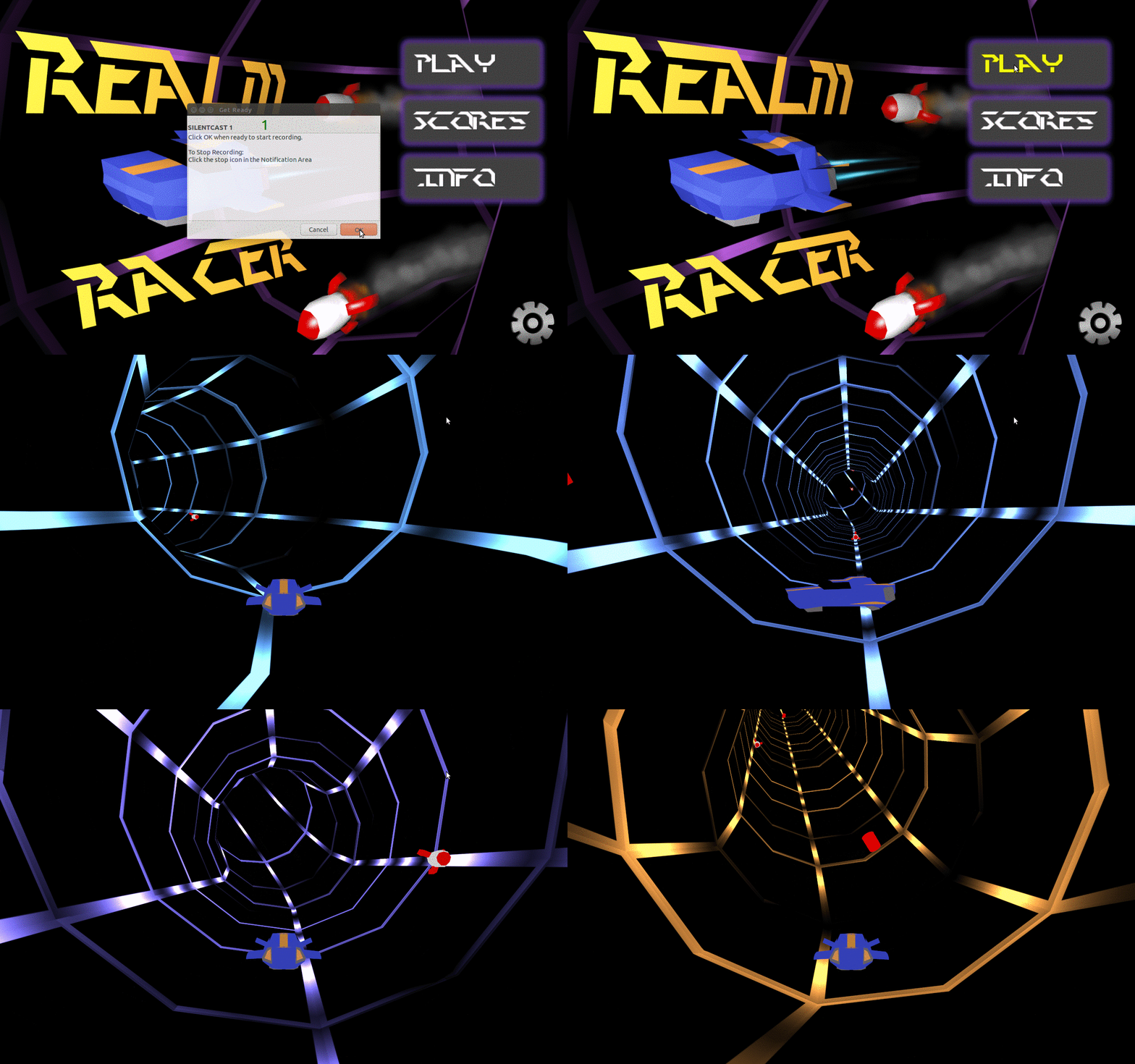
     This shouldn’t be very long. As Joraaver noted last week, I managed to design and integrate a decent looking Main Menu into the game. Voila:

main menu gifWe haven't done any loading screen, which is why you see a funny flash of the tube before the actual game appears.

     To be a little more technical, JME currently has 3 GUI systems in place, either with native support or actively supported by developers. These are: nifty GUI, tonegodgui, and Lemur. All three are fine options, but Lemur really shows a tremendous amount of flexibility for very complex GUIs (even 3D). Granted, our GUIs will be simple, but Lemur also boasts CSS like styling, with which I am quite familiar. For this game, we are using Lemur.

     Since I’m no UI/UX artist, I went looking for examples or information to help me get started. Here are some of what I found helpful:

Continue Reading

Realm Racer Devlog #3: Finally, Shaders

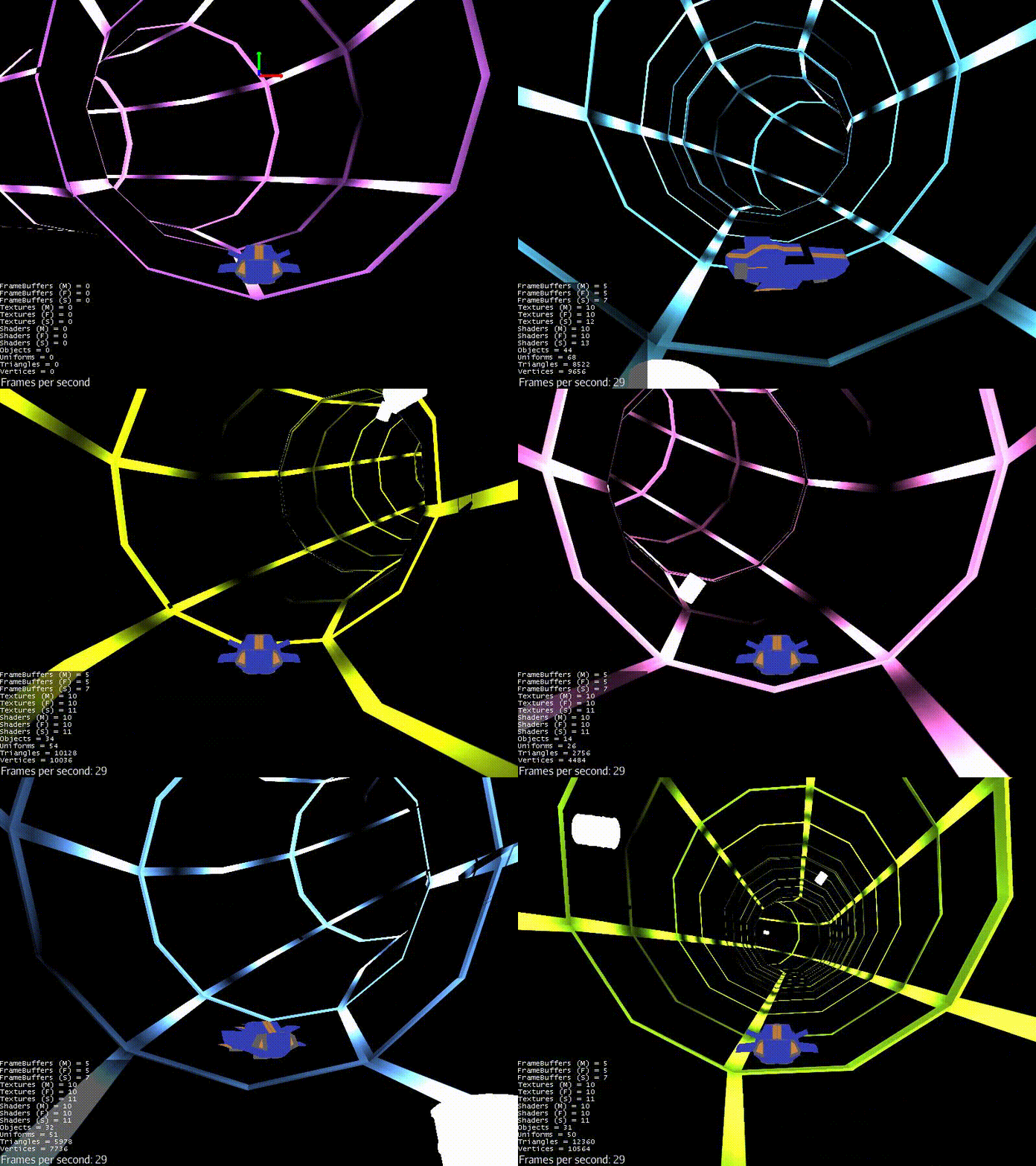
It's the end of spring break for us, which means it's high time for another update. “Update” means pretty pictures, so a gif:

In this post I'll talk about the look development of the whole thing. So let's get started.

From Humble Beginnings

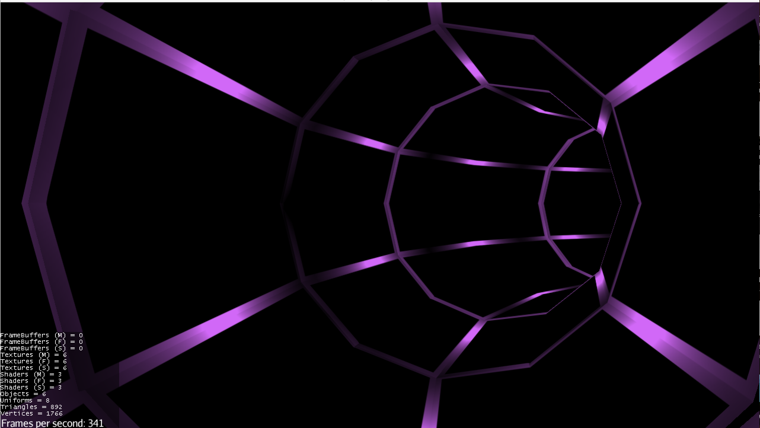
Last time you saw the game, it looked like this:

previous time

That art was more “placeholder” art. I wanted to make the player feel like he or she is moving very quickly through a tunnel with lights evenly spaced within. Thus, I needed the lines of the tube to darken and lighten evenly. I could have painted a diffuse/color map with light and dark areas, but I decided to lightmap it. Why? Well, 1) with actual lights generating the lightmap the result is more realistic, and 2) I wanted to learn the process.

So I went into Blender, set up a lighting scheme, rendered the textures, and plopped them into the game. The result was this:

LIGHTMAPPED

To me, this looked pretty good. But I was bothered by the fact that the lights weren't as bright as I wanted them to be. Something about lightmapping that I hadn't realized was that with basic lightmapping, things don't get brighter.

Continue Reading

Stumbling Upon Emergent Gameplay

     My friend and I were playing Far Cry 4 last week when we had an experience neither of us will soon forget. We stumbled upon a stellar example of emergent gameplay. I'll tell you the story and then talk a little bit about what I've learned about the concept.

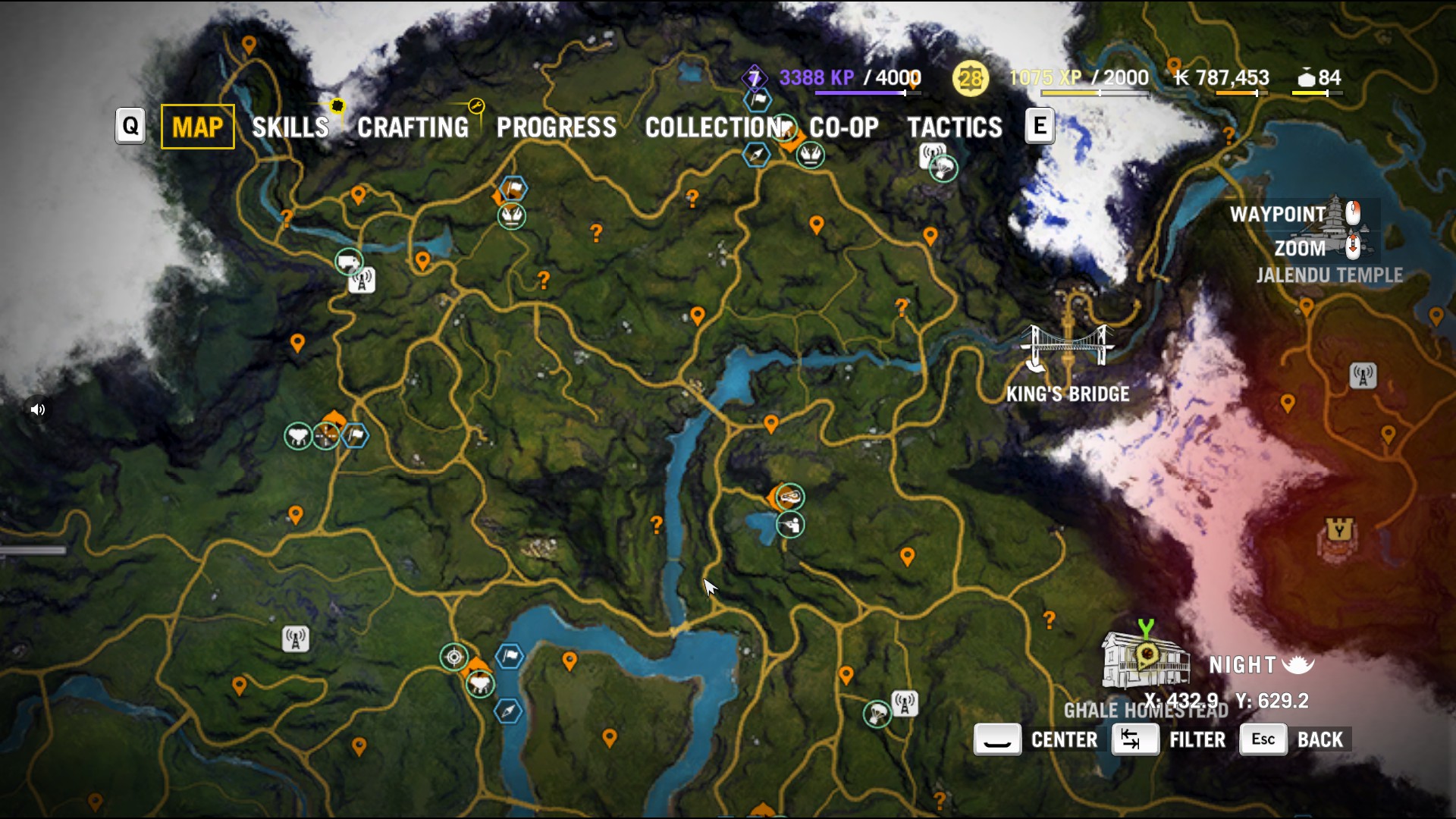
WARNING: There may be a spoiler or two in this article. I'm not saying anything explicit about the game's narrative, but a picture of a map may reveal information you don't want to know (or something like that). Tread carefully.

The Encounter

     Far Cry 4, for those unaware, is an open-world first-person game set in the dangerous yet beautiful nation of Kyrat.

     When my friend and I play, we go "question mark hunting." All the hidden caves, items, or places on the island that one has not stumbled upon show up as question marks on the map, like so:

     Thus, we went on our merry way playing Dora the Explorer. One of us was Dora and the other was Boots. It was all tremendous fun, until we reached our next location.

Continue Reading

Tags

A Heuristic Analysis of Your Game

      I'm currently taking a course in human-computer interaction (HCI) in which the focus is to create a smooth and exemplary user experience for a smartwatch app by applying the principles we learn in class. One of the only requirements for our app is that it not be a game. Why? Building a game for a watch is an entirely different beast than building an app, and the "human-computer interaction" part requires a slightly different approach.

      That being said, we recently learned of Nielsen's heuristics for interface design and the method of heuristic analysis in general. I'd like to share with you all how a heuristic analysis is done and why it might be a good thing to do for your game. I also did a heuristic analysis of two games to see what I could learn, and how I could apply those principles in the future.

Heuristic Analysis

      Before I go any further I must say that if you would like to hear an explanation on this topic from the man himself, here is the link: How to Conduct a Heuristic Evaluation. A majority of

Continue Reading

Tags

Perspective + Announcement

The announcement is going to be pretty short. Here is the lowdown: I'm going to GDC. That's right--in 2 days I'll be heading on over to SF and taking in all the things the annual event has to offer!

That's all, as far as announcements go. Now for the real topic of conversation--

Perspective

In a small studio, most people wear multiple hats during the development process. For teams of less than 10 people, game design is often a decision made by multiple members, not all of whom hold the title "game designer." Similarly, a small studio may not hire a specific person to deal with all PR material--it may be a joint venture by some programmers and artists. This is perfectly acceptable given a lack of resources and time. But visual and sound artists as well as programmers have decisions to make too. So why aren't things like game architecture or implementation decisions discussed with people not in the discipline? I believe we can attribute this to a lack of perspective.

In a game jam I recently participated in, I had my first real experience with a game engine (Unity, to be specific). I had written 2 games before

Continue Reading

Tags